The purpose of articles are to give an insight look into the TMG’s favourite band.
Rock Sound and Kerrang!’s articles have a introductory paragraph, here information is given about early life, recent tours, previous albums and the production of the upcoming album. While Q magazine tends to go straight into the interview, both concepts work well as the Q style is good if the reader has a good knowledge of the featured artist. Generally articles have enlarged letters, this is so the audience focuses their eye on that key area, this is why this enlarged font is used on the first letter of the article or at a important part .(such as an exclusive) All articles are laid out in about 3 columns with at least 2 separate paragraphs on each column.
On the majority of articles their is a singular image spreading across one page and a small part of the text page, this is to create a flowing look so the audience can easily switch between the two pages. On more formal magazines such as Q they have a singular image within the text with a sub-heading, this is used to aid the reader with understanding what the journalist is trying to get across.
In the centre of the text there is usually a pull quote, this is surrounded by a clear box or shape matching the rule of 3 colour co-ordination. This is favourable amongst readers as it urges them to read on. They are cleverly designed as the quote isn’t in bold in the main text so the reader has to read through the whole article to find this, that is why this pull quote is in the second half of the text.
In my magazine i am going to include one large image covering one page and slightly into the text page, with one or two images at the bottom with a thick black border around them so they are clearly separate from the focused image. I will include three columns of text within my article so it will tesselate well. I will include a large font, with a unique twist to draw the reader in. I will also include a sub heading with a coloured/patterned line underneath to separate this from my main text.
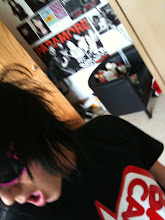
My article is based on Ben Daniels within my magazine he is a upcoming rock star, he has already made 2 albums but is generally un heard of. The article will promote his upcoming tour and give the readers an incite into his personal life (common in most magazines at the start of the article). I will edit the images either using the Colour Splash App, iPhoto or within Photoshop CS3. I aim to make the images black and white, therefore matching the overall theme of the magazine (dark and twisted), with the Colour Splash App you can section off which part of your image to leave coloured, therefore i could keep a rose, that he is holding colourful. I would use this to focus the eye on the rose which would be central therefore giving a deeper meaning to the rose and the audience can see the whole imagine at once.
Search
Target Market Music


About Me
Copyright 2009
Dan Miller. Powered by Blogger
Blogger Templates created by Deluxe Templates
Wordpress by Wpthemescreator
Blogger Showcase
Blogger Templates created by Deluxe Templates
Wordpress by Wpthemescreator
Blogger Showcase
0 comments:
Post a Comment